Wednesday, May 8, 2013

On campus and off campus events

Event #1


The on campus event I attended was titled: The Arts, Creativity and Learning: Integrating the Innate Habits Required for Art-Making into Learning for Transformation. The guest speaker was Lisa Fitzhugh, who is the founder of Arts Corps and also a creativity motivator within corporations and organizations. She first talked about the primary attribute of creativity: it begins with who we are. What see is influenced by what we know from our past experiences. Emotions color our reality and our reactions to present experiences are based on those emotions. Next Fitzhugh talked about creativity with a “moral compass” and her work with Amazon. Amazon has a reputation for being a creative company, but her opinion is that they were going about it in the wrong way because management was not considering Amazon’s impact on the planet. This was an event I was glad I attended. One of the main points that made the biggest impression on me was her encouragement to keep trying new things that wouldn’t normally be tried and keep doing it.

Event #2

The off campus event I attended was Jessica Hische at the Society of Design at the Whittaker Center in Harrisburg. She began by talking about lettering, calligraphy and type design and the main differences between the three: lettering is the drawing of letters, words and phrases; calligraphy is the writing of letters, words, and phrases; and type design is the system of letters, numbers, glyphs, etc. Hische also talked about designing her letterings and some font design programs (FontLab, Glyphs, and Robofont). Since “procrastiworking” is a term she coined for the unproductive activities she does when she says she should be doing work, the second half of the event focused on procrastiworking, followed by a Q&A session with the audience.

Typography Journal, Week 12

The example below shows incorrect use of an apostrophe. A prime mark was used instead.


In this example, there are two serif typefaces being used on the same sign. Aside from that, there is way too much spacing between "booksellers" and "publishers", plus it looks as if the two words are also different point sizes.


Thursday, May 2, 2013

Updated menu

A screenshot of my in-progress menu is below (after the in-progress critique from yesterday). I still have a bit of work to do on it but I'm happy with how it's coming along. The order of the pages needs work and I'll get to that soon. (It can get confusing in my mind when I'm trying to visualize the order of my pages!)


Appetizers

Grilled Vegetable & Bacon Pineapple Skewers - 15
Grilled cucumber, tomato, mushroom & squash w/ bacon wrapped pineapple on a wooden skewer. Served
w/ spicy orange sauce or light coconut vanilla cream on the side.

Crab & Kumara Bisque - 20
A creamy, thick soup of crab & sweet potato.

Papaya Lime Soup - 15
Fresh, local papaya blended w/lime juice, oranges, mango & pumpkin. Served chilled.

Ahi Poke - 25
Raw ahi tuna w/ shallots, green onion, Soy sauce & sesame seeds.

Creamy Crab Lettuce Wraps with Coconut-Lime Dip - 20

Crab Stuffed Cucumbers - 20

Entrées

Poisson cru (National dish of French Polynesia) - 40
Raw yellow fin tuna & halibut marinated w/ fresh limejuice. Served w/ coconut milk, chopped tomato,
cucumber, carrot & spring onion over white rice or fresh cabbage & Romaine lettuce salad.

Macadamia & Coconut Crusted Tilapia - 45
Fresh baked tilapia w/ a coating of finely crushed macadamias & coconut. Served w/ grilled sesame
mango asparagus & poi (taro mixed w/ banana & coconut milk).

Grilled Shutome (Swordfish) w/ Baked Taro - 50
Locally caught swordfish seasoned w/ our special blend of local herbs & spices. Served w/ baked
sliced taro (a potato-like root vegetable) & a side of fresh mango salsa (mild or spicy).

Pork Curry w/ Bananas - 45
Local pork seasoned w/ curry & garlic in a papaya banana sauce. Served w/ sweet potatoes.

Coconut Vanilla Chevrettes - 40
Local, small freshwater shrimp sautéed in vanilla, olive oil, dark rum & coconut milk. Served w/ lightly
sautéed tomatoes, cucumber & sweet corn.

Teriyaki Broccoli Beef, Pork or Chicken - 35
Choice of beef, pork or chicken & broccoli teriyaki served w/ Pineapple fried rice.

Desserts

Kiwi Mango Cheesecake - 25

White Chocolate Macadamia Tart - 20

Tahitian Vanilla Crème Brulee - 30

Po’e - 20
A Tahitian pudding w/ vanilla, banana, pineapple & orange topped w/ toasted coconut.

Breadfruit Tart - 30
Breadfruit, banana, strawberry & star fruit in a macadamia & almond crust.

Drinks

Hinano -  15
Tahitian beer

Watermelon Honey Martini - 20       Watermelon, honey, lime & silver rum.

Maita'I (Tahitian for “good”) - 20       Rum, orange curacao, lime & orange.

Piña Colada - 20

Lava Flow - 25
Rum, coconut rum, strawberries, banana, pineapple & coconut cream.

Maui’s Wines, local Hawaiian winery             
by the glass - 25           by the bottle - 75
            Pineapple wines
                              Hula O’Maui
                              Maui Blanc

             Grape wines
                              Ulupalakua Red
                              Lokelani (sparkling wine)


****************************************************************************


Monday, April 29, 2013

Typography Journal, Week 11

I found some interesting logos that effectively use negative space to create beautiful logos. The first example uses a nice serif typeface which seems to work rather well with the personality of the logo that it accompanies. It seems as if it's saying, "I may be on the small side, but I'm still better than you." The typeface has high contrast and elliptical drops. The eyes and bowls are small with rather generous counters.


Sunday, April 28, 2013

menu project- story & menu items

Restaurant story

Kӓwili was founded in 2007 by Tania Hoani and Kalino Kalua. Tania and Kalino first met in 2005 after Tania’s (a Tahitian native) culinary demonstration at the Kapalua Wine and Food Festival in Maui. Impressed by Tania’s skills, Kalino (a Hawaiian native and culinary instructor) approached her about teaching at the Maui Culinary Academy. After learning they have several mutual friends from the restaurant business, Kalino and Tania soon became close friends and began to discuss ideas for opening a restaurant together. They both love the traditional foods from their native islands and wanted to feature both cuisines on their menu. Kӓwili, the Hawaiian word for “blend”, is the result of blending traditional and modern Tahitian and Hawaiian dishes.

·         Tania (“Polynesian flower” in Tahitian)
·         (Kalino is Hawaiian for “brilliant one”)
·         Kӓwili is the Hawaiian word for “blend”.

_____________________________________________________________________

Menu items (so far)


Appetizers
Grilled fresh fruit kabob
Fresh pineapple, banana, mango and papaya grilled on a wooden skewer. Served with a spicy orange sauce and coconut vanilla cream.
Almond & Coconut Crusted Tilapia
Fresh baked tilapia with a coating of finely crushed macadamias and coconut. Served with grilled sesame mango asparagus, poi (taro mixed with banana and coconut milk).
Crab & Kumara Bisque
A thick soup of crab and sweet potato.
Papaya Soup


Entrées
Poisson cru (National dish of French Polynesia)
Raw yellow fin tuna & halibut marinated w/ fresh limejuice. Served with coconut milk, chopped tomato, cucumber, carrot and spring onion over white rice.
Pineapple fried rice
Braised Swordfish w/ Sweet Potatoes
Pork Curry with Bananas
Local pork seasoned with curry and garlic in a papaya banana sauce. Served with sweet potatoes.
Coconut Vanilla Chevrettes
Small freshwater shrimp sautéed in vanilla, olive oil, dark rum and coconut milk.

Tuesday, April 23, 2013

Menu project- logo sketches & typefaces


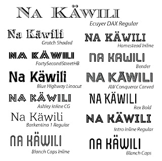
Logo typefaces I've experimented with are below. The typeface I chose is the one at the top (Ecuyer DAX Regular).


Monday, April 22, 2013

Menu project naming worksheets

It wasn't easy coming up with names...


My evaluation:


My group's evaluation:


Typography Journal, Week 10


The bold sans serif typeface and the embellishments on this ad for Kraft cheese are what caught my eyes at first. Maybe I'm wrong, but if it were me, I would right align the word endless and maybe move inspiration a little more to the right also. Choosing a different color besides white (maybe a lighter shade of the blue used in the background) might help it from getting lost with the photo behind it.
Next I noticed the serif typeface used in the paragraph under the heading. "Cute" was the first word that came to mind to describe this typeface and I'd like to try to figure out what it is so I can possibly use it myself. It has a low x-height, low contrast, small bowls, eyes, and counters, unbracketed serifs, circular drops, high ascenders, and seemingly short descenders.

The example below is a page from a print magazine article. The reason I chose it was because I feel the hierarchy is well-defined by using color and the organization of the information is easy to follow.


Friday, April 19, 2013

Menu project

Links for research:

http://en.wikipedia.org/wiki/Polynesia#Island_groups
http://www.pbs.org/wayfinders/polynesian.html
http://en.wikipedia.org/wiki/Polynesia
http://www.gayot.com/travel/features/hawaii/hawaiian_fish.html
http://en.wikipedia.org/wiki/M%C4%81ori_culture
http://www.coffeetimes.com/may98.htm
http://en.wikipedia.org/wiki/Polynesian_navigation
http://www.gayot.com/restaurants/menusavvy_hawaiian.html
http://critiki.com/

Main Polynesia

  1. American Samoa
  2. Cook Islands
  3. Easter Island (called Rapa Nui in the Rapa Nui language)
  4. French Polynesia
    • Tahiti
    • Bora Bora (also known as the "Pearl of the Pacific")
    • Marquesas Islands
    • Society Islands
    • Tuamotu Islands
    • Gambier Islands
    • Austral Islands
    • Bass Islands
  5. Hawaii
  6. New Zealand
  7. Niue
  8. Norfolk Island
  9. Pitcairn Islands
  10. Samoa
  11. Tokelau
  12. Tonga
  13. Tuvalu
  14. Wallis and Futuna
  15. Rotuma

Cook Islands cuisine

  • ika mata = raw fish
    • a favorite main course of the Cook Islands
    • maororo- flying fish
    • is served with coconut cream & cooked root vegetables like taro, kumara, breadfruit or boiled green bananas
  • Coconut, fish, cassava, taro & tropical fruits are the basic ingredients in most Cook Island meals. Ground ovens are used to slowly cook traditional foods. Meat is not common. People of the Cook Islands also use salt, onions, garlic and some acidic ingredients. (http://foodhistory.pbworks.com/w/page/12799485/Polynesian)
Food Customs at Ceremonial Occasions:
      Special occasions are marked by a feast called an umukai(literally "food from the oven"). Meat is the main dish, supplemented with ika and potato salad. Kava, made from the root of the pepper plant, is a traditional ceremonial drink. It is nonalcoholic but can be consciousness-altering. Christian missionaries virtually eliminated the drink from the islands; today, the word "kava" is used for any alcoholic beverage. (http://www.everyculture.com/Bo-Co/Cook-Islands.html)

Cook Islanders are known for their hospitable and generous, if somewhat reserved, nature. When invited to someone's home, it is customary to bring a small gift for the host. Upon returning from a voyage, travelers are greeted with a garland of flowers placed around their necks; they are seen off the same way before departures. (http://www.everyculture.com/Bo-Co/Cook-Islands.html#ixzz2R1oya9rg)

Tahitian Cuisine

     National Tahitian dish is poisson cru, which is raw fish marinated in lime juice and coconut milk. Fish is the main staple of the Tahitian diet. Fish is often marinated in coconut milk before it is baked or grilled. Poisson cru is a very popular dish that consists of raw fish marinated in limejuice that is often served in a salad. Many dishes also include chicken, pork, sweet potatoes, breadfruit, rice, local fruit and vegetables such as papaya, mangoes, pineapples, bananas and fafa, which is a type of spinach. Other ingredients are tomatoes, onion, cucumber, carrot and pepper. Local pork is also a common ingredient in Tahitian recipes. The national Tahitian drink is a beer called Hinano. (http://www.tahititours.com/food.html)      Chevrettes (freshwater shrimp) are also popular in Tahitian dishes and are found throughout the Tahitian islands. The Tahitian dessert that is most popular is called po'e. It's a pudding made with taro root and flavored with banana, vanilla, papaya or pumpkin and topped with a coconut milk sauce. Another dessert is called kato, which are similar to biscuits and are made with coconut milk. Local coffee is flavored with locally-grown vanilla or fresh coconut cream. (http://www.lighthousetravel.net/Tahitian_Food.html)
     Most food is cooked in traditional pit ovens, called ahimaa, which are made by digging a hole in the ground. Stones are placed in the pit and heated by fire. Banana leaves are used to wrap the food and are then thrown onto the hot stones. They are covered by dirt and left to bake for several hours. The traditonal feast is called tamaaraa.

Moodboard:


My proposed restaurant will be a blend of Hawaiian, Tahitian and French Polynesian cuisine that will feature local seafood, pork, fruits and vegetables. The name is yet to be determined. I finally found a few decent websites with some useful lists of Hawaiian words (http://hawaiian-words.com/basics/common/- this one has pronunciations; http://tony.tran.tripod.com/Hawaiian_phrases.htm; http://www.mauimapp.com/moolelo/hwnwdshw.htm; http://www.thetahititraveler.com/general-information/society/language-in-tahiti/). A search for Tahitian words was less successful but I did at least find something I could use.

Folklore/mythology:
http://www.pantheon.org/articles/h/hawaiiki.html
http://www.windows2universe.org/mythology/polynesia_culture.html


Sunday, April 14, 2013

Typography Journal, Week 9

This first example is one of an improper typeface. It's an animal hospital I work for part-time, both as a veterinary assistant and web designer. (My disclaimer: I am not responsible for the current design. I merely maintain the site but have been working on a new design that is expected to be completed by the summer.) The typeface for the entire site is the dreaded Comic Sans. (And again, I'd like to mention that I did not design the current site.)


Monday, April 8, 2013

Project 7- poster

Color inspiration:


Type family used:


Final version of poster:


My sketches for this project were posted a couple weeks prior to this post.

Typography Journal, Week 8

Aside from the clever use of the grain graphic in place of the lowercase i in "Grains", I love the sans serif typeface on this Great Grains cereal box. The high x-height and generous counters give it a beautiful, pleasant, friendly appearance that seems appropriate not just for a "grown-up" cereal, but also for emotional appeal as it seems to greet the reader with a smile that says "good morning". (Who would want an angry typeface greeting them on their cereal box in the morning?) The vertical stress of the lowercase a somehow adds to the flow of the words and creates a soft arc with the lowercase characters that precede them.


This is such a beautiful script typeface, which reminds me of Jessica Hische.

Saturday, March 30, 2013

Typography Journal, Week 7

One of the trends in typography this year is combining several different typefaces. The "rule" is to not use 2 typefaces (sometimes 3, but more than that isn't normally recommended). The first two examples I posted are (in my opinion) effective uses of multiple typefaces and have inspired me to look past what I normally would do and try something different and keep up with current design trends. Isn't that how designers improve their skills? This website has many inspiring examples of current trends in typography: http://www.groovecommerce.com/ecommerce-blog/10-typography-trends-for-web-designers-in-2013/. I was excited to see one of the featured websites is the Society of Design under "#4: White Space"!


This next example is both clever and cute!


Typography Journal, Week 6


In this example, I am referring to the right sidebar's list of featured articles (to the right is the enlarged section). In my opinion, this typeface is a poor choice at size because the counters, bowls and eyes close up, which in turn, decreases readability.

I did a double-take when I saw this next example because I didn't realize at first that the N is a 2 on its side. I think the slab serif typeface chosen by the designer is appropriate and this is a creative twist on the word.

Sunday, March 10, 2013

Evert Bloemsma research


MY RESEARCH


EVERT BLOEMSMA

Evert Bloemsma was a Dutch typeface designer who studied graphic design at the Arnhem Art Academy from 1976 to 1981. It was during this time that he developed a high interest in Swiss typography. Swiss design influenced his type designs, particularly his first typeface, Balance. In all his typefaces, Bloemsma placed as much concentration on the black space of the letterform as he did on the white space in and around the characters.
Early in his career, Bloemsma worked on the production of digital fonts at URW in Hamburg, Germany while developing his own typeface designs. Following his employment at URW, he worked as a typographer in the Netherlands. He was part of a team that produced laserprinter bitmap fonts, which he then studied to learn how low-resolution output affected the forms of typefaces.
Bloemsma also taught typography at the Art Academy of Breda and Arnhem. In addition to working as a designer, Bloemsma also was a photographer with concentration in panoramic architectural photography with a panoramic camera that he built himself.
He was an advocate for healthy lifestyle and was an avid recumbent cyclist. It was a shock to the design community when he died of heart failure in 2005 at the age of 46. Aside from his four typefaces, Evert Bloemsma is remembered for his original mind, weird sense of humor, enthusiasm, and sincere dedication. (http://typophile.com/node/10573)


FF BALANCE (1993):


The preliminary version of Balance was presented at Bloemsma’s design school graduation exhibition in 1981. His view at the time he began designing Balance was that “there was no place for serifs” in the new technological age. Despite his fascination with Swiss typography, he admired unconventional design, particularly Antique Olive by French Designer, Roger Excoffon.


Bloemsma incorporated Antique Olive’s top-heavy characters and inverted stress into Balance. He felt that the top-heaviness would have a “positive effect on readability” because readability essentially rests on the top half of most characters. Also supporting readability is horizontal stressing, or “inverted stress”, which tries to make up for the lack of serifs. (Dutch Type by Jan Middendorp, page 237)

Bloemsma tried several times to sell the first versions of Balance to some well-known international foundries, including Linotype, Monotype, and ITC. In 1986 While working in Hamburg at the German type foundry, URW, Bloemsma digitized Balance by using Ikarus, the type design and production software that was developed by URW, for converting existing typefaces and logos into digital format. URW did not end up publishing the font. Years later in 1993, it was published by FontShop, but it would take some time for Balance to become a well-received by other designers. Today, it is primarily used by European designers and has unfortunately does not seem to have had as much use in the US.

Cocon (1998):

Attempts were made with the first sketches of Cocon to “erase every trace of handwriting”, but after an unsuccessful experiment with straight terminals, Bloemsma added “asymmetrical rounding” to the terminals of the stems. This rounding of the terminals is effective at smoothly moving the eye forward from left to right. Bloemsma defined Cocon as a “serious typeface” which is relative to the hours he spent designing it and the range of possibilities for its use. This typeface has been used more frequently in Europe and has been used for a few American brands you might recognize. (Dutch Type by Jan Middendorp, page 237)

FF AVANCE (2000):


When Bloemsma was designing Avance, he went back to a more traditional approach in typeface design. He was known to have said, “In our trade, tradition acts as an inescapable magnet” and there is “no point” in ignoring those traditions. The trick, Bloemsma said, is to “deal shrewdly and creatively with tradition”. A restful, regular appearance to words is possible through serifs, which guide our eyes along the text. In addition to creating a typeface with serifs, Bloemsma knew what he wanted to avoid. Lack of ornament and decoration, asymmetry, and a non-finished appearance were his cleaver ways of keeping with tradition. He also wanted it to be as spatially economical as Times Roman without having the same high contrast.

FF LEGATO (2004):


Legato is a music term that means to play evenly and smoothly without any pause between the notes. Bloemsma used this idea to visually connect the characters in his typeface by way of improving the unity of the word with “internal tension”. The resulting typeface is one that builds better word images and improves legibility by using diagonal stress. The interior curves of the counters oppose the exterior curves, which may sound like a strange way to accomplish unity, but instead makes the characters clearer and more interesting. Legato has been awarded twice: once in 2004 by Typographica (a review and commentary of typefaces and typography books) and once by Letter.2 (by Association Typographique Internationale) in 2011. This was Evert Bloemsma’s last typeface before his untimely death in 2005.


MY T-SHIRT

I chose Legato as the typeface for my shirt since it was the only of Bloemsma's fonts to win awards. The major objective of this typeface is to improve readability and many professional typographers seem to agree that it succeeds in doing so. I chose that fact, plus Legato's award-winning status to create the statement on my shirt that reads "improving legibility & winning awards since 2004". I used all weights in the Legato family (except bold condensed) for the statement.


MY SKETCHES (previously posted)